Redesigned Nuts.com’s most-trafficked page to clarify product information and strengthen customer trust, resulting in an 8% increase in CVR

Context

Role
Sole Product Designer
Project Status
🚀 Launched
Timeline
October – December 2022 (3 months)
Team
1 Product Manager, 2 Engineers, 3 Graphic Designers, 3 Merchants, 1 Copywriter

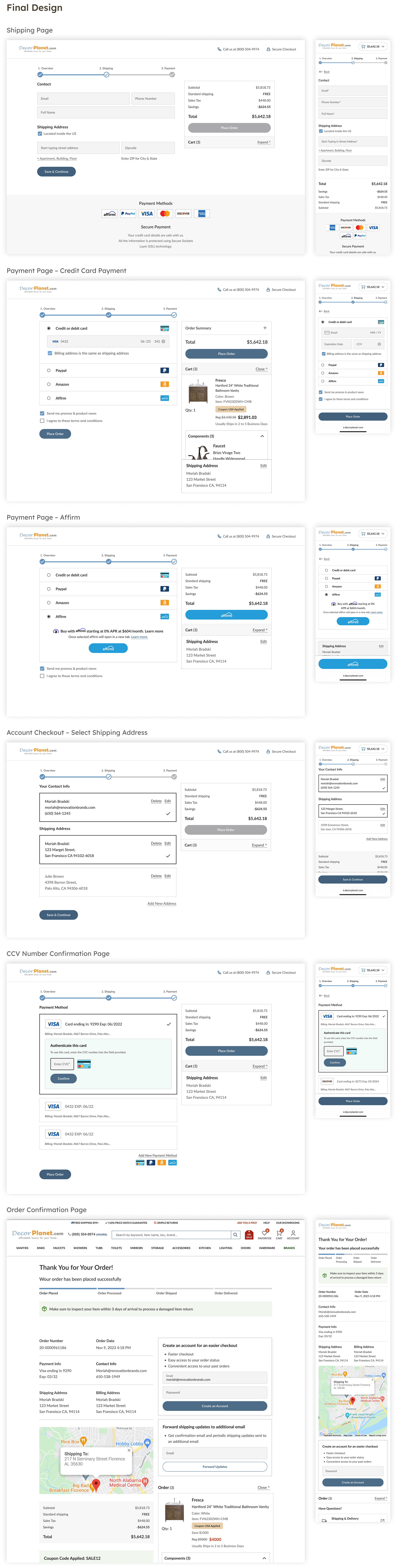
As my first major initiative at Nuts.com, I led the redesign of Nuts.com's Product Detail Page (PDP), the highest-traffic page on site, receiving 60% of landing traffic. The initiative was part of a broader product roadmap effort to modernize the site. The goal of the re-design was to both elevate the look and feel of the page, and address lack of customer trust and information discoverability.

Significance

The PDP was the entry point for 60% of all site traffic, yet 65% of visitors bounced before engaging further, signaling the page wasn't meeting their needs.
Decor Planet’s legacy checkout showed high drop-off across key steps. First-time buyers were blocked by forced sign-in, while B2B customers lacked support for multi-address and multi-payment workflows.The challenge was to streamline the path to purchase for both segments, without disrupting revenue or adding new technical dependencies.

Problem

How might we make the PDP feel trustworthy and navigable so customers can confidently evaluate and purchase products without customer support?
Decor Planet’s legacy checkout showed high drop-off across key steps. First-time buyers were blocked by forced sign-in, while B2B customers lacked support for multi-address and multi-payment workflows.The challenge was to streamline the path to purchase for both segments, without disrupting revenue or adding new technical dependencies.

Challenge

How might we make the PDP feel trustworthy and navigable so customers can confidently evaluate and purchase products without customer support?
Decor Planet’s legacy checkout showed high drop-off across key steps. First-time buyers were blocked by forced sign-in, while B2B customers lacked support for multi-address and multi-payment workflows.The challenge was to streamline the path to purchase for both segments, without disrupting revenue or adding new technical dependencies.

Constraints

  • 3 month timeline, no access to Decor Planet users for direct research
  • No real-time inventory or shipping estimates from third-party vendors, adding ambiguity during checkout
  • Multiple stakeholders across product, engineering, and leadership with differing views on UX risk, business impact, and implementation scope

Success metrics / KPIs:

  • Increased conversion rate
  • Higher add to cart rate
  • Lower bounce rate & exit rate

Insights & solutions

Key finding #1:
👎 Forced sign-in created early abandonment
At the start of the Decor Planet checkout process, a user is required to enter in their email address. If their email address is recognized by the system, a user must remember their account password to continue with the process. Recordings of user interactions on the website revealed that many users got frustrated because they could not remember their passwords and were forced to reset them.
Solution:
✅ Create a guest checkout option to reduce drop-off
The new checkout design allows users to check out as a guest. For users that want to check out with an account, they now also have the option to reset their password if they know they can't remember it. The layout follows Baymard Research best practices by giving equal visual hierarchy to the "Account Checkout" and "Guest Checkout" options.
Key finding #2:
👎 Existence of unnecessary text fields.
According to Baymard Research, minimizing the number of form fields users must consider during checkout will reduce the drop-off rate. Decor Planet's checkout had a lot of redundant and unnecessary form fields. It required some users to fill out their name twice, and had form fields like "Company Name" and "Consumer Type" displayed by default.
Solution:
✅ Minimize text fields as much as possible
The number of contact and address form fields in checkout was reduced from 8 to 5. Historical consumer data suggested that fields like "Apt/Suit" and "Company Name" were not used often, so they were nested behind a link.
Key finding #3:
👎 Users can’t view their order total and items in cart during checkout
The customer's order total and cart preview were not visible during the first two steps of the checkout process. Session recordings revealed that many users would exit the checkout process to double-check what was in their cart. They often did this before entering in their payment information to make sure they were purchasing the right items and that their order total was correct.
Solution:
✅ Display user's order total panel and product overview in a panel
The new checkout design includes a panel on the right-hand side that provides the order total, cost breakdown, and a preview of the items in your cart during all stages of checkout.
Key finding #4:
👎 High drop-off rate at review step
According to Google Analytics, the checkout order review page has a high drop-off rate.
Solution:
✅ Remove the order review page
The “Order Review” step was removed from the checkout process so that the payment page became the last step with the order review information added in a panel on the right-hand side.

Final results

Version 3 A/B test findings on (07/10/2022)

Final results of A/B test after making design changes

✔️ Increase in conversion rate: + 15.98%
✔️ Increase in revenue per visitor + 4.44%
✔️ Decrease in exit rate of: – 9.73%

Reflection

My takeaways from this project

Learnings:

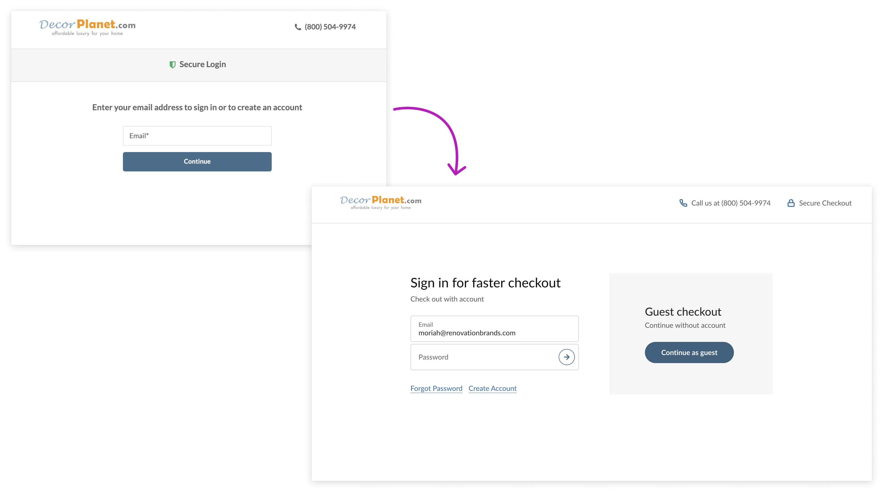
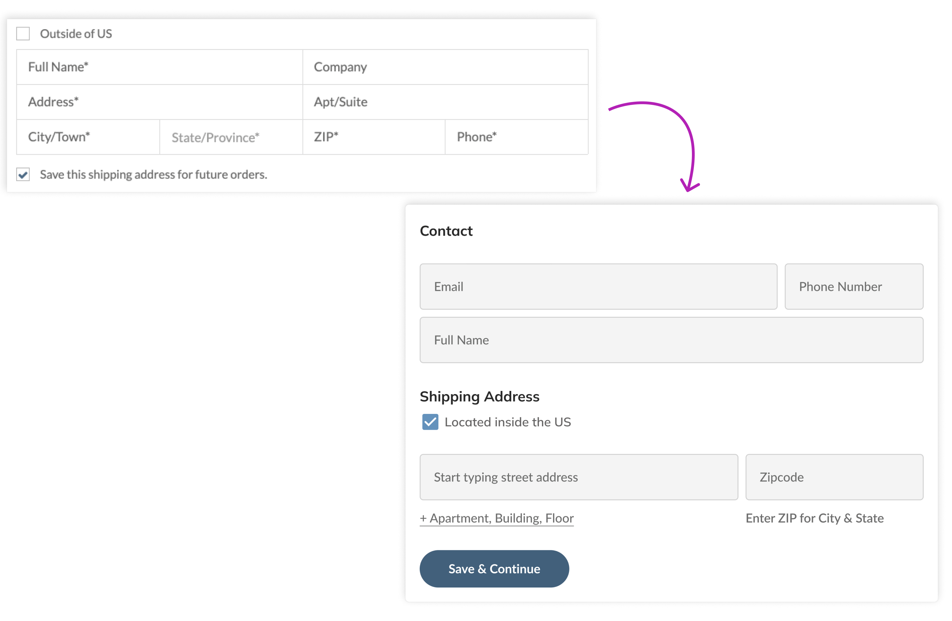
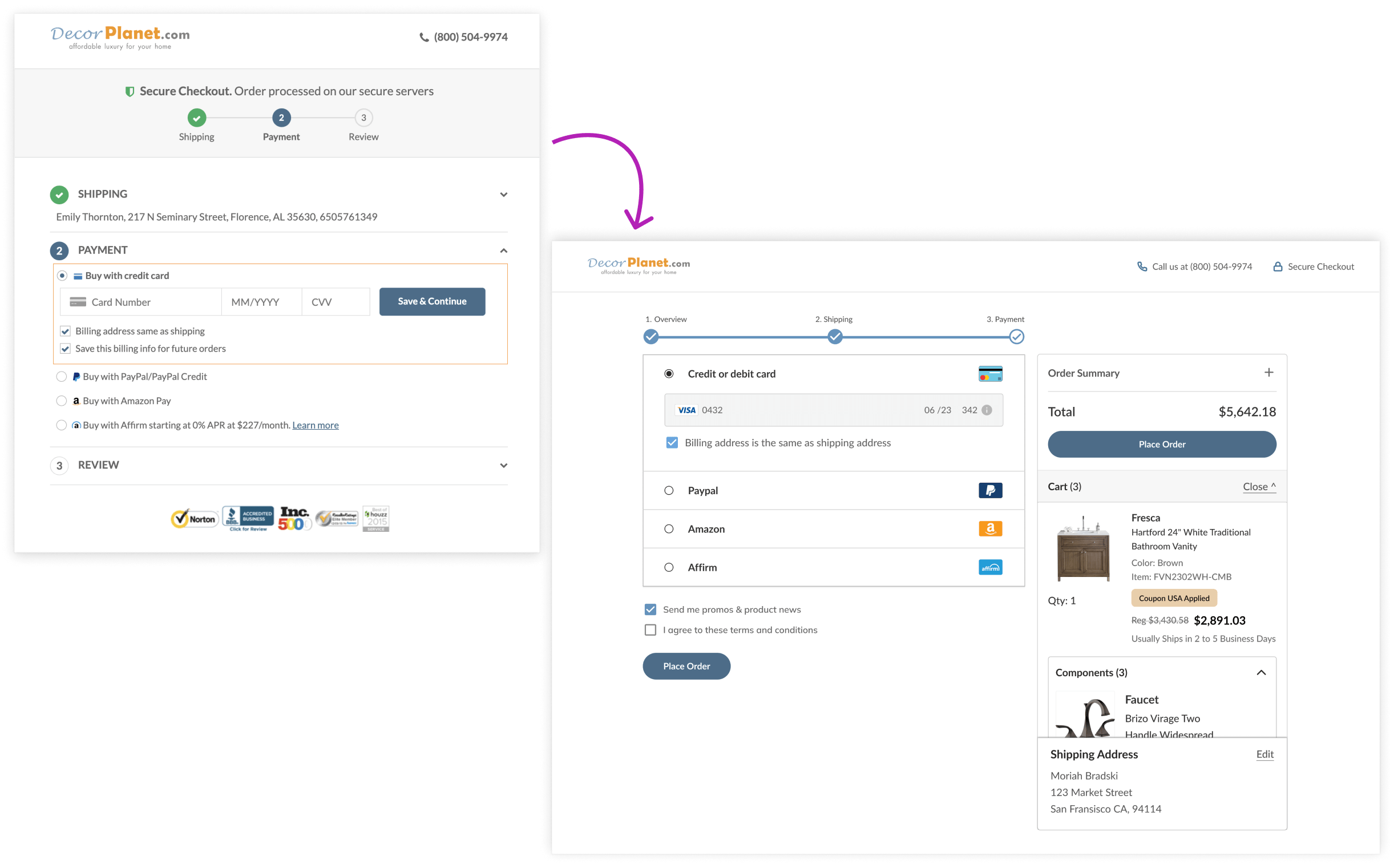
The biggest lesson I learned from this project was that reducing the number of steps in a flow can have a big impact on user follow-through rates.

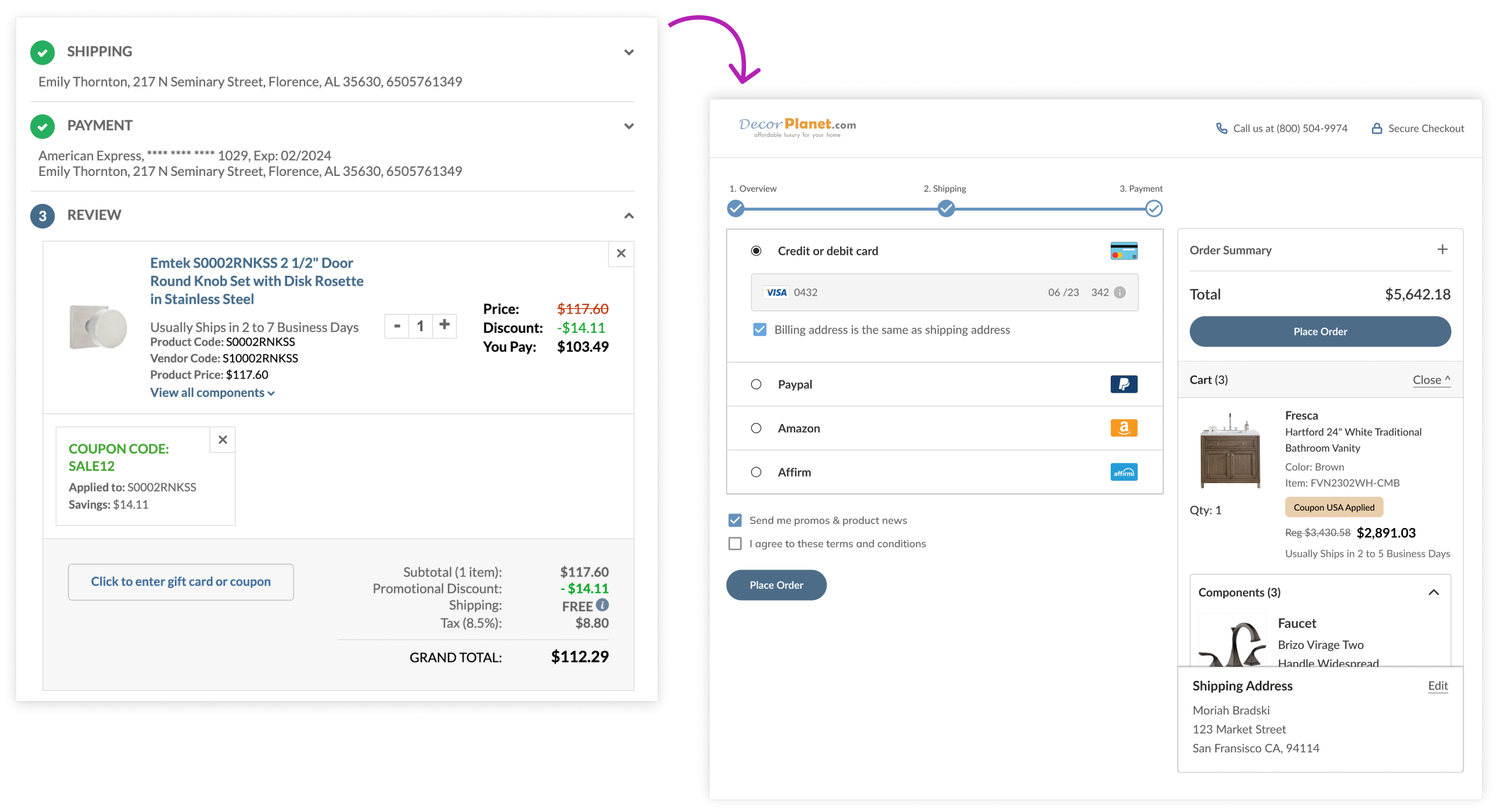
Things I would have done different:

The disabled "Place order" button shown during checkout distracted some users who tried clicking on it. In my next iteration of the checkout flow, I would hide this button until it becomes active.

Limitations:

A lot of buttons and text boxes in the checkout flow weren't tagged in Google Analytics. The lack of tags made it difficult to compare user behavior in the new and old checkout flows. Due to the lack of information, there were probably some pain points in the new design that were left undetected during the A/B test.

Go to next project

RTA cabinet store product page re-design