NYC based Product Designer specializing in growth, strategy, and end-to-end solutions.
I create impactful design solutions by:

Understanding the user journey

Analyzing the data

Balancing business goals
Moriah Bradski
👋 Hello my name is Moriah, I am a multidisciplinary product designer.
I'm a Bay Area based designer who loves solving real customer problems, moving business metrics, and delivering impactful solutions.

NYC-Based Product Designer specializing in growth, strategy, and end-to-end solutions.


NYC-Based Product Designer specializing in growth, strategy, and end-to-end solutions.


Understanding the user journey
Analyzing the data
Balancing business goals
NYC based Product Designer specializing in growth, strategy, and end-to-end solutions.
I create impactful design solutions by:
Understanding the user journey
Analyzing the data
Balancing business goals
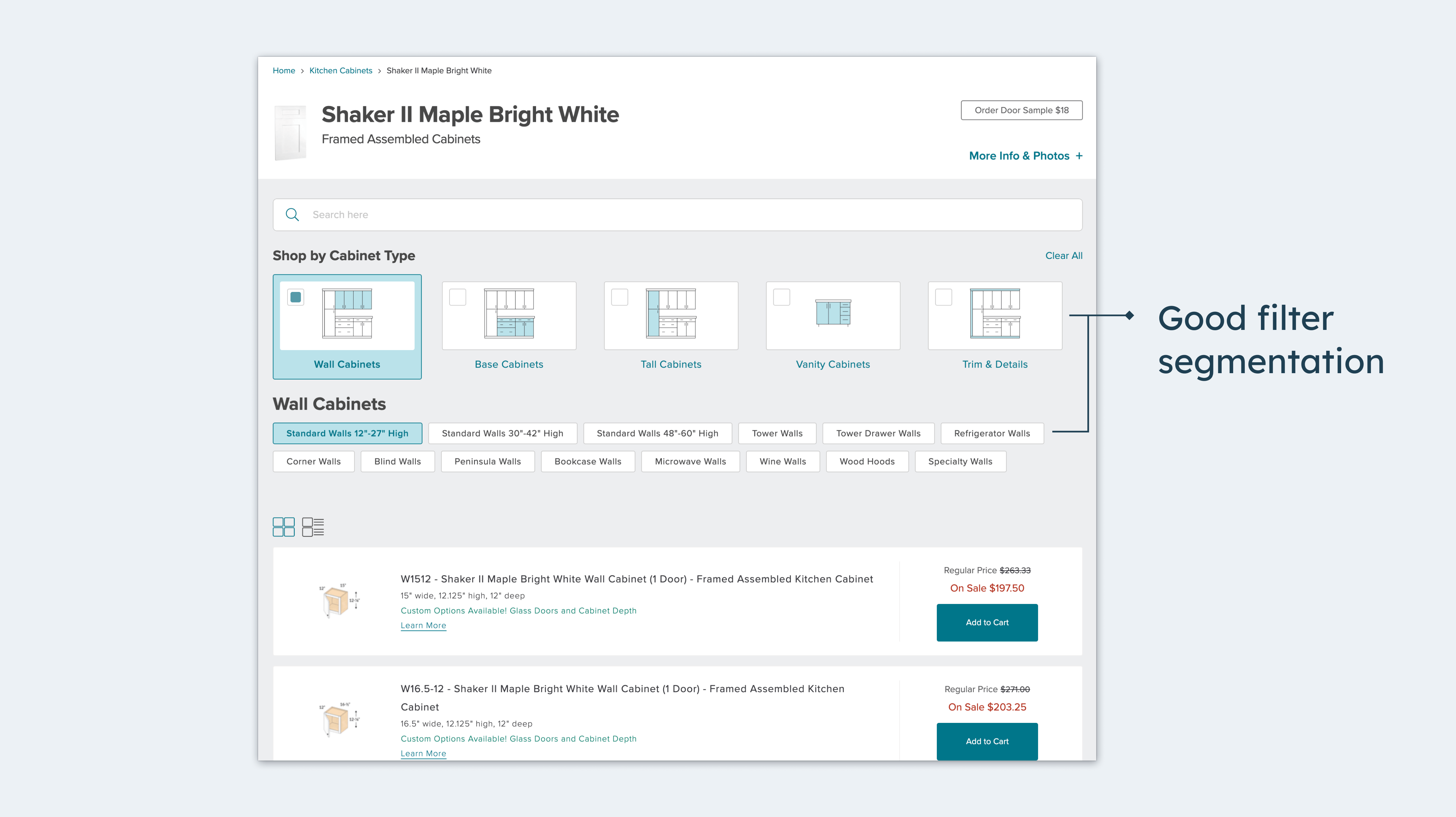
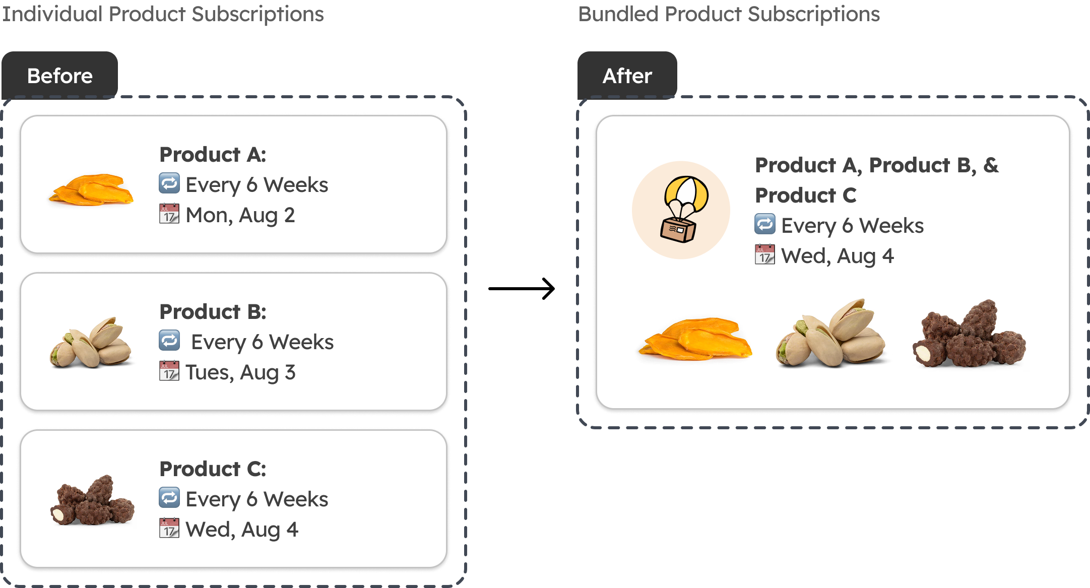
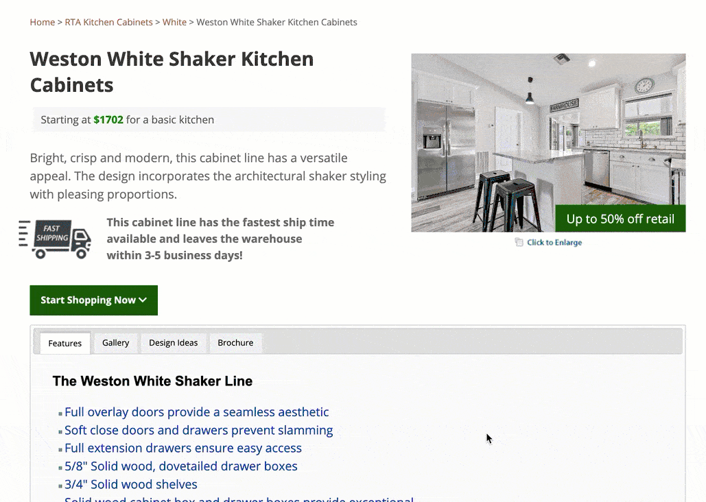
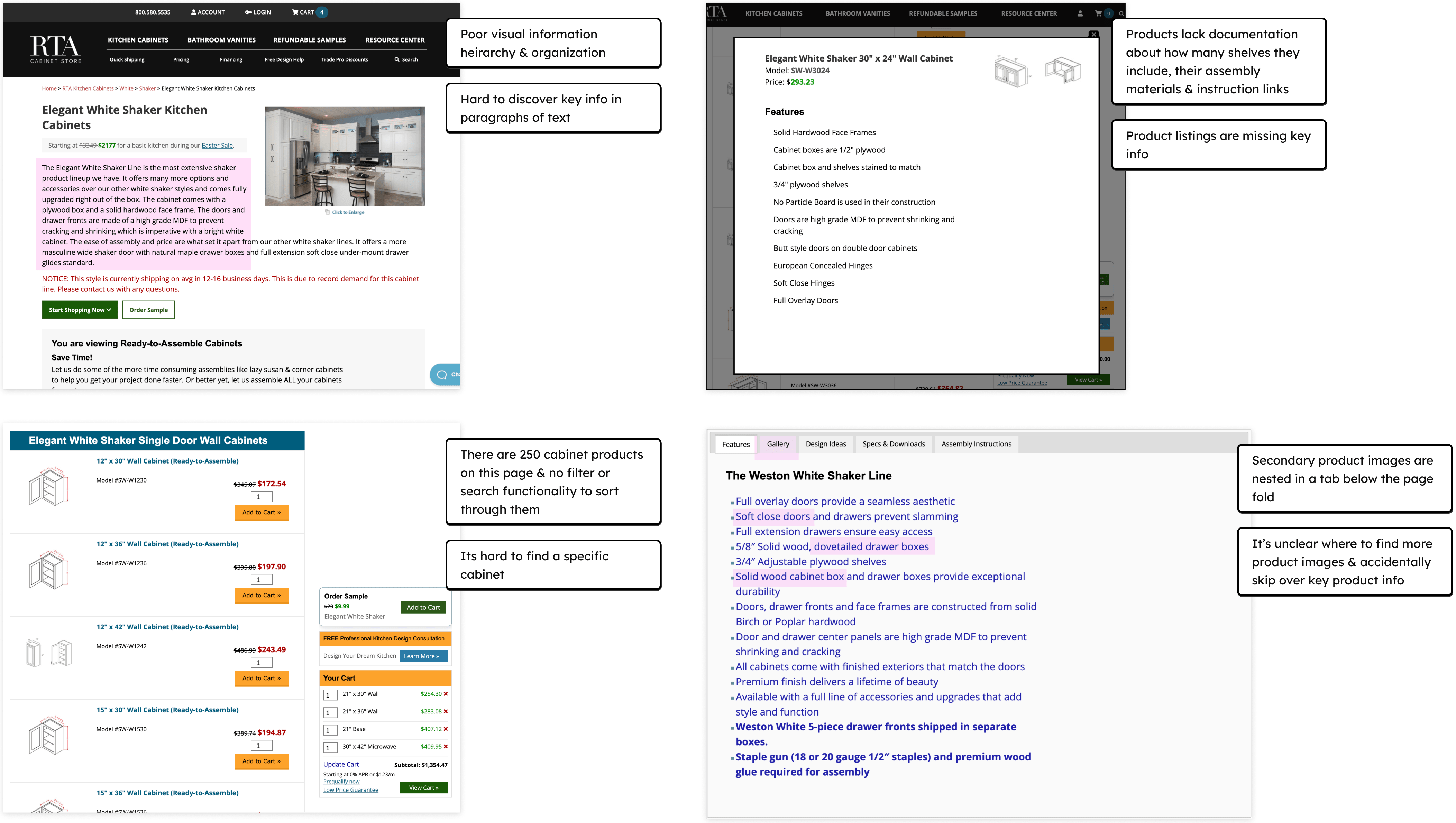
RTA Desktop Product Detail Page Heuristic Review
NYC-Based Product Designer specializing in growth, strategy, and end-to-end solutions.
RTA Desktop Product Detail Page Heuristic Review